they came in wanting an upgrade. they left with a brand.
two friends. 28 years. three cities. one brand finally sounding like itself.
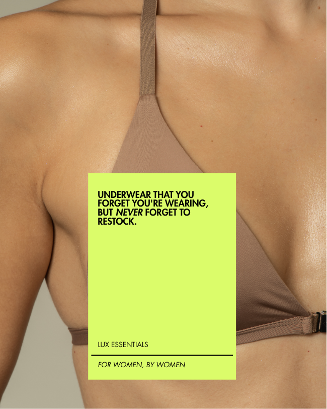
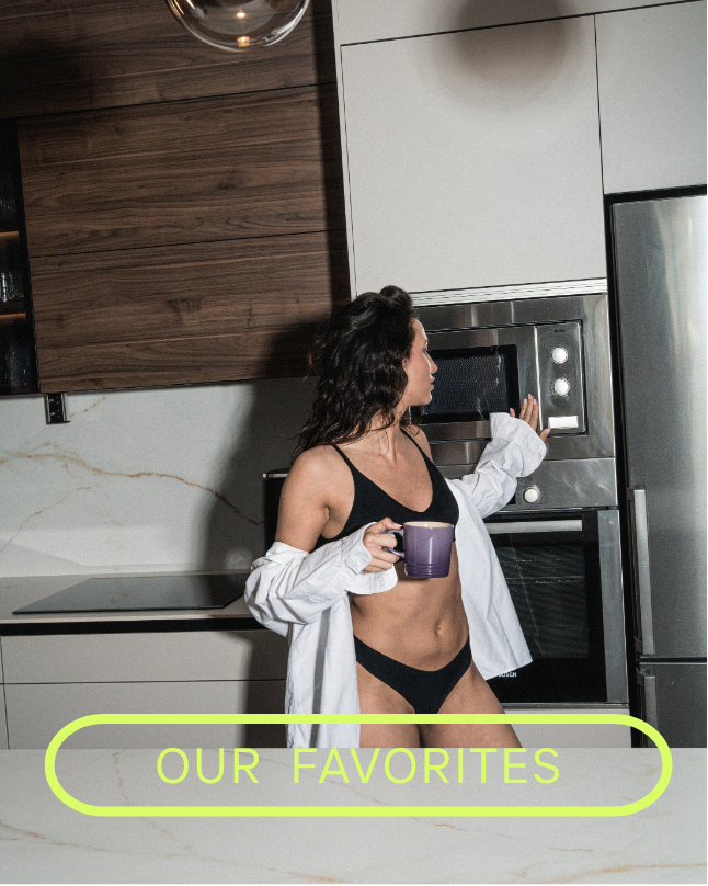
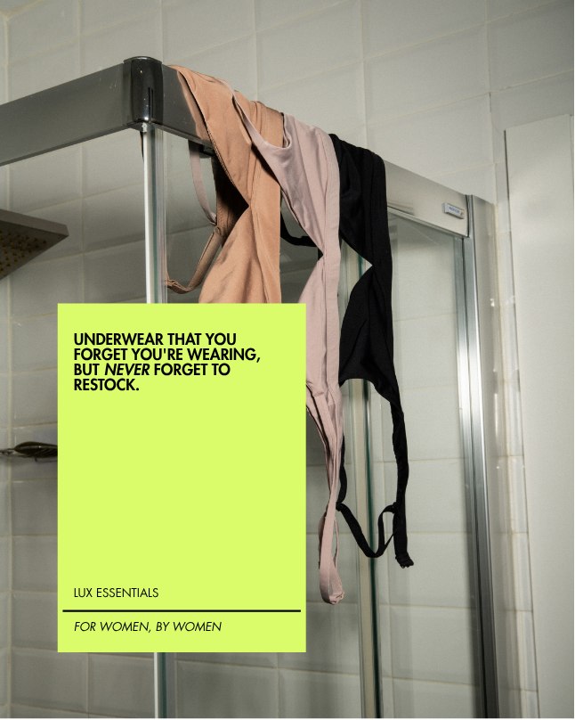
CLOUD&BUTTERsee it live ↗an underwear brand with a killer product but no voice. in two months we gave it strategy, voice and a visual system, then over 200 pieces of content in a single shoot day. they came in asking for an upgrade; they left with a brand.
months of strategic process
pieces of content in one shoot day
integrated services: strategy · production · web
- killer product: wire-free, made in colombia, obsessively tested
- a powerful story and founders with purpose
- undefined voice, inconsistent branding, invisible founders
- a brand that knows exactly what it is
- a voice that's built, not borrowed
- +200 pieces ready to feed every channel for months
- a coherent visual system + a new website
“we serve our woman deeply, not everyone broadly.”
everyone wants reach. we bet on depth. instead of speaking to every woman a little, CLOUD&BUTTER speaks to one woman completely, her body, her day, her standards. when a brand knows exactly who it's for, the right people feel seen and the wrong ones scroll past. that's not a smaller audience, it's a loyal one.
it's easy to build a brand against something, against wires, against discomfort, against the big names. but a brand built in opposition spends its life reacting to what it rejects, and ends up shaped by it. so we built from affirmation instead: CLOUD&BUTTER already had its own seat at the table. it never needed to push anyone off theirs.
vanity metrics are loud, followers, likes, reach, so we ignored them. the number that actually proves a brand is working is the restock: the woman who buys again, then tells a friend. one customer who comes back is worth more than a thousand who look once and scroll on. every piece of content was built to earn the second purchase, not just the first impression.
they came in ready to trade the loud yellow for a safe, on-trend butter tone. we pushed back hard. in a category drowning in beige neutrals, that yellow was the single most recognizable thing they owned, softening it to fit in would have erased their biggest advantage. so instead of toning it down, we turned it up: a signature you can spot from across the room.
the yellow that almost wasn't
they came in wanting to swap the disruptive yellow for a safe butter yellow. we pitched the opposite: elevate it and turn it into their signature, their quality stamp. in a category of neutrals, the twisted yellow builds memory. today they're the only brand in their category with a color you recognize from across the room.
we started by mapping the category, who's loud, who's missing, where the white space actually is. then we narrowed it to the three women CLOUD&BUTTER truly serves, and the one central bet everything else would hang from. no content, no design, until this was locked.
before deciding what to say, we defined how it should sound: 5 voice principles, 4 tones for different moments, and a set of sacred words the brand owns, plus the ones it never touches. this is what makes a caption unmistakably CLOUD&BUTTER before you even see the logo.
then we turned the strategy into a machine: 6 content pillars, a 30-day calendar, and style guides anyone on the team could run with. we closed with a single production day that banked +200 pieces of content, enough to feed every channel for months without scrambling.
“guava was the key element we didn't know we were missing. daniela understood exactly what the core and soul of our brand is, and put it in black and white for everyone to understand.”
this isn't magic. it's method, and it can be learned. book a free 30-min call and we start today, no strings attached.